Customer Stories
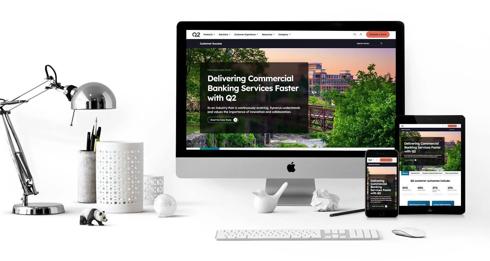
The Customer Stories webpage within Q2.com showcases the success of companies that use Q2 Software’s products. This includes everything from innovation, upgrades, implementation, and service delivery it’s about how these companies improved their internal functions and improved client relationships.
The Challenge
One of the main challenges with designing this page was we knew it would keep evolving with more customers being added and that we would need to make everything clear and not feel crowded. When starting the design for this page, I did a fair number of comps on mobile and desktop to see what issues we might run into with the amount of information needed on these pages. On the inside pages, we needed to add videos on some, and others had images in the hero, but they all needed to be cohesive. Other challenges I needed to take into consideration:
This had to be built with modules we already had to save cost and time
Due to project managers wanting a carousal in the hero, there were concerns I needed to communicate based on UX best practices/accessibility issues and offering alternatives
These pages, while part of Q2.com, needed to take on a slightly different UI while still looking like they were part of the Q2 Software family of pages
I would need to train the assigned Project Manager and Copywriter to make updates in HubSpot
All the elements had to be collected before Dev handoff
This was a tight turn-around and lots of people involved
The Solution
After speaking with the Project Manager and others involved in the job and asking many questions, I understood the goal and what they wanted to get across. I made many design sketches for both mobile and desktop views to figure out ahead of time what some of the challenges would be. I wanted to focus on how to showcase our customers in a way that would easily allow our users to find them and try to learn how other companies were talking about similar problems. One of the most important challenges that was handled as best as possible was the carousel in the hero. Because that needed to stay as that function, I designed it to have multiple ways to advance to the next screen. I did this to make it more user-friendly for everyone.
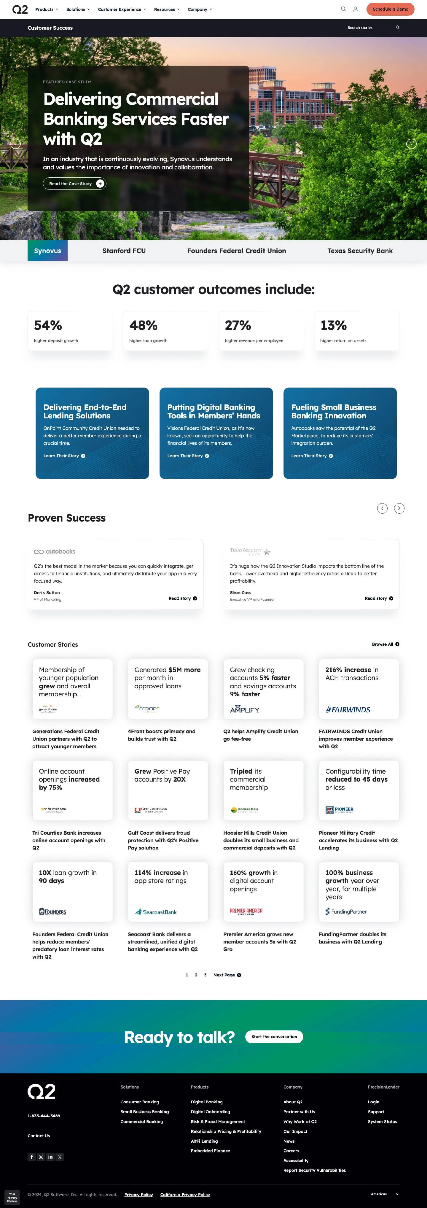
Main Customer Stories webpage
The New Design
With the knowledge in hand and the research, I came up with a plan and proceeded from there. With the new design, we were able to showcase our customers in a more user-friendly way, here are some of the features that were important on the main page:
Bringing the Q2 customer Data % up the page as close to the folder as possible
Accomplishing the goal of breaking up information to not overload the viewer
The layout made it clear what the user would be taken too
As mentioned earlier in the Challenge, the links on the main pages opened to other downstream pages. I brought over elements from the main Customer Stories to the downstream pages to continue the consistent look. In the hero of the downstream, I designed it so that one could easily switch an image to a video. Here are a few other important notes on the downstream pages:
Within each page, there was a section added that highlighted who they were
There also needed to be a downloadable case study on each page
I felt it was important to work with the copywriters and allow only so much copy within each section to drive them to the Case Study Download
Inside page example
Conclusion
With the Customer Stories pages, I accomplished the goal set forth from the first meeting. There were many iterations and many more meetings to discuss various pain points and, in general, all the modules of the pages. Compromises in the design were made that included ways to make modules more user-friendly. There is a good basis in place for any changes to the page going forward. The Customer Stories pages will forever be evolving through the years.
Copy on the website: multiple copywriters
Front End Developer: multiple dev team members


