Beyond Transformation Microsite
The purpose of this site was to educate lenders who wanted to attract customers in the COVID-19 landscape and who needed to learn how to best present themselves and their offerings in that difficult time.
The Challenge
COVID-19 was a difficult time for a lot of companies to retain and attract customers regardless of what type of company. My goal was to design a site that was able to take a lot of information and place it into bitesize chunks that would keep the interest of the target audience. Here are some things I wanted to take into consideration when researching and sketching out my ideas before building them in XD:
I wanted to add some interactivity, but in a way that was not overpowering
It was requested that there should be two different ways on the screen to act as a sign-up for more information
There needed to be a way for the client to interact with the website
Knowing there would be elements that could not carry into the mobile design, I needed to draw out the stages before designing
Collecting all the physical add-ons to the links such as PDFs or Infographics that could be downloaded and making sure I had the video and all the parts before sending them to Dev
The Solution
We needed to focus on UX Best Practices and what the project manager and her team wanted. I understood the goals, the user, and the messaging which allowed me to deep dive into some ideas, to come up with this design. I was able to work directly with our Dev team to implement an animated hero via code, that would allow words to come up one at a time. As well as having conversations about the overlay “ask” that needed to stay within a certain area and having a small form at the bottom of the webpage.
The new design
The New Design
With the help of our Dev Team, we were able to bring to life the needed animations and interactivity within the page, and the goal was able to be implemented. We were able to track the responses to the added form and the overlay signup sticky. That Sticky, however, was not added to the mobile design due to UX best practices for the user. Nor were the animated words, those stayed static on mobile. Some extra things that needed to be taken into consideration:
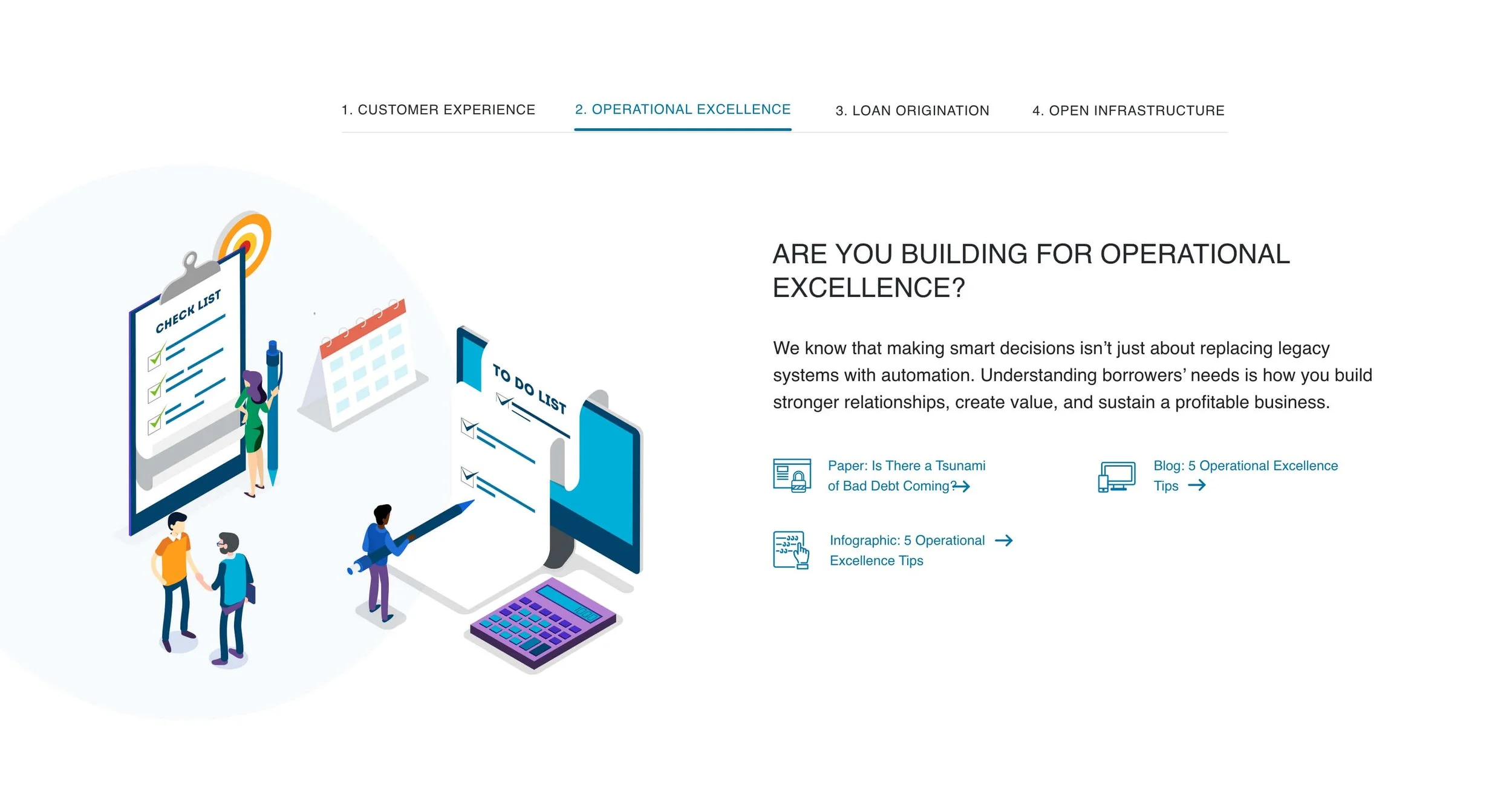
Within each tab of the copy, multiple links needed consistent treatment
Each tab had its own illustration that I needed to design within our brand colors and style guide
Conclusion
There were iterations to the design as it went through reviews, and new copy or sections were added many different times. But with communication and follow-up, we were able to have as smooth of a process as possible. Working as a team, we were able to bring to life the ask of the project and push the design further.
Copy on the website: Sam Arnold
Front End Developer: Michael Cignata


