
Glossary Page Redesign
The name of the company is confidential - we will call it, “SoftwareX”
The goal of this exercise was to think about the problem (how the original page is set up) from a user’s point of view and determine how to improve the fundamental design to better suit the user and decrease the likelihood of pain points for them. This software is not meant to be used on a mobile device, only to be used as a desktop application.

The Challenge
While looking at their current Glossary webpage there were quite a few usability issues that needed to be addressed as well. These were:
It’s confusing seeing the, “Export Glossaries” button on top and then seeing another “Export” button directly below it next to the alphabet.
I would have expected to see a Search button next to the dialog box VS the Advance button directly next to it. That takes away from the common usability of everyday things users are used to seeing on other software programs.
Plus, the location makes it difficult to tell what the user is supposed to search for – there is no clear direction
The order of the blue buttons up top - this is the order I would suggest putting them in and why: Glossary Tool Tip, New Glossary, Load Glossaries, and then Export Glossaries.
The reason I think Tool Tip needs to go in front is that they can immediately go and search now – if they get stuck – that tool tip is up front and center – ready to help.
New Glossary 2nd place because – because they can simply click I to t see the new glossaries without having to search.
Load Glossaries in 3rd place because it has more to do with new glossaries and there for, I feel it should stay together with new glossaries.
The last should be Export because it’s more familiar at the end for placement and the comfort level should be where they are used to seeing things.
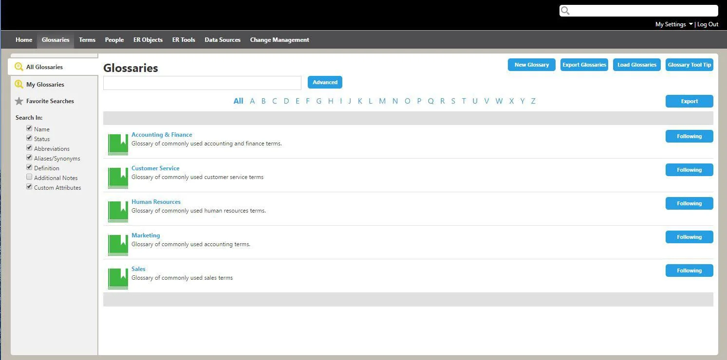
The original glossary page
The best way to help the user would be to have a handful of users (the companies’ clients: Data Stewards and Business Analysts who consist of both tech savvy and non-tech savvy) test the current live page and give feedback of what was difficult for them and what worked. Since the users are located throughout the world, this meeting would have taken place via a virtual meeting/screen share.
The Redesign
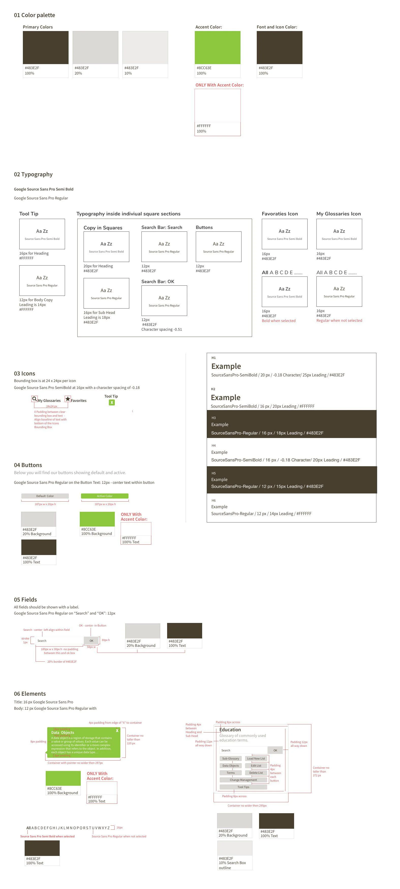
There were certain requirements of the redesigned webpage that needed to stay or change, that I had to take into consideration while updating this page in a 4px grid where the fonts and padding also needed to be a division of 4px. Plus, there were requirements for the established, “Use Cases”. The Use Cases included items such as:
Data Stewards who need to locate certain terms and other glossary information under 30 seconds, without having to dig deep into the glossary
Not everybody is familiar with glossary names and terms alone
Data Stewards would need to be able to easily and quickly edit, change or re-arrange information in the glossary
There could potentially be thousands of terms
The Design Choices
The redesigned glossary page - Showing under the, “ALL” info
Even though this is a redesign, I wanted to still follow along with keeping the style clean and using as much white space as possible. This was important because you still want it to look like it came from SoftwareX.
I kept the, “My Glossaries, Favorites and the All (ABC’s)” that way they can still look up something fast if they know name of the information they are looking for or if it’s been turned into a favorite – easy access.
It was important that each section to have its own search bar – which searches directly within that grouping, so that the search stays more focused and allows less confusion.
For the active stage of the button, I did decide to use the accent color and chose to use a white font in a similar manner of what is in the above set bar. The white font color was also used in the Tool Tip – to make the tool tip pop off the screen and to stay consistent to how the green accent color is treated in other areas
Style Guide
For the Style Guide, there was already a standard brand system of fonts and colors that had to be used for the new designs. For the redesign, I did come up with other icons to be able to help the user distinguish certain areas. I placed the elements in the Atomic Design System format and red-lined it for easier handoff to the off-shore developers. For the page sample, I included a red-lined markup of the page that was to be redesigned.
Conclusion
When first designing the layout, I made a couple of really rough drawings on draft paper with a clear draft ruler and pencils – so I could think in terms of pixels and size. I used Sketch to build the layout of the site as well as the columns and grids. The Style Guide was designed inside of Sketch as well. This design exercise took about one and a half days to complete.
I enjoyed adding the red-lines and learning about how this really helps developers to code a more accurate design. There is software that will produce redlines but, for this project I decided to do them by hand instead.