MuttBuddy: A UX Case Study
UI Design, UX Design, Branding, Visual Design, User Research, Prototyping in Sketch and InVision
The Objective
Design a dog-focused mobile app at a time when few animal-friendly establishments existed, helping users easily find them, connect with other dog owners, and share experiences. The app was intended to be genuinely user-friendly for everyone, with a strong focus on accessibility, including extensive research on color blindness.
My Role
Led the project from research to final prototype, handling user research, personas, sketches, wireframes, visual design, branding, copywriting, and usability testing. Applied ADA and color-blind accessibility principles, iterated designs based on feedback, and consulted developers on feasibility to ensure a fully inclusive, intuitive experience.

The Problem To Be Solved
It can be very difficult for many dog owners to find truly animal-friendly establishments, especially if located in a different town. Dealing with everyone’s different viewpoint of what is considered, “animal friendly” can be very frustrating to the animal owner.
Not to mention, if you want to meet up with friends, but don’t want to spend time on the phone looking for a dog-friendly environment. Or, if you find a place — you now you have to open up yet another app to send your friends a message about it.
The Solution
My first step towards a solution was to identify the problems that dog owners have had locating dog-friendly establishments and also to understand the unique behaviors of those dog owners. I then created an app that would address these issues and serve as a social platform allowing users to connect with other dog lovers.
The MuttBuddy app allows users to explore establishments that are animal-friendly with filters that allow them to individualize their search. The app also includes social content that allows users to share experiences, photos and connect with and message other users.
User Research
I needed to learn more about my users and their pain points. My goals were to understand what they wanted from establishments, whether they took their dogs out (and why or why not), and what their positive and negative social experiences were when taking their dogs out. To keep my research focused, I started with a KWHL chart.
The KWHL chart included:
What do you already know?
What do you need to find out?
How will you learn it?
What do you hope to learn?
To gather more user insights, I created a survey using Google Forms. The survey showed overlapping opinions across users, but it also revealed new insights. It also helped me narrow down users who didn’t quite fit the typical Muttbuddy user profile. The survey received 54 responses, and I selected 5 participants for interviews.

KWHL Chart
Survey Summary
The majority of the testers are dog owners, with 53.7% owning at least one dog. The second largest group of testers are people wanting to become owners.
Approximately 68% of testers take their dog(s) traveling with them more than ten times a year. Many of the users reported that they like to take their dog out socially with them, some more than ten times a month and the vast majority of them currently use Google as their main search engine to find out if a place is animal friendly. A smaller percentage of people use other means like: calling, word of mouth, walk-in or other user-review sites like Yelp.
Testers shared that they have faced many problems with getting accurate and updated information from the above sites and sources. As a result, many testers felt that recommended establishments were not dog-friendly as they had been led to believe and their experiences were not as expected. They felt that having updated, vetted information from one trusted source would solve this problem.

Survey Results Infographic
Interview Summary
Users expressed a lot of frustration over how many websites have incomplete information regarding whether a certain business is actually dog friendly or not. Many found themselves having to do multiple tasks in order to locate a truly dog friendly environment such as a restaurant or a bar.
About 80% of the interviewees, spoke a lot about how much they enjoy going places and would prefer to go to dog friendly places either with friends or by themselves. Another 20% spoke about how they would ask detailed questions of the establishments.
Competitor Analysis (Heuristic Evaluation)
This evaluation takes into account the different, Nielsen Norman Group (NNG) usability heuristic principles that apply to the single macro-areas. For instance, regarding the content evaluation, the heuristics useful to this scope were: “aesthetic and minimalist design”, “match between system and the real world” and “consistency and standards”. An evaluation of the websites according the 10 NNG usability heuristics is also included. The goal was to evaluate, the strengths and weaknesses of competitor sites to learn more about pain points for the user as well as to see what was done correctly.
The competitive analysis focuses primarily on the user’s journey and desire to easily locate dog friendly establishments. The analysis reviews and compares: BringFido, Go Pet Friendly and Trips With Pets as these are direct competitors to a dog friendly site.
Many of the comparison features were selected and grouped into four macro areas: Content, IA/UI, Layout/Visual design and Help. Below is a summary of select “high” pain point findings: (You can read more about all of them here)
BringFido is a well-known web and mobile application to help locate dog friendly places. This site has a huge amount of information and offerings. They have many ways for users to contact them should they have any issues.
But there were some areas where they pushed the boundaries and cause pain points for users. Starting with content, there were too many steps involved with signing up for this app and the layout felt crowded with the added advertisement and their placement to direct imagery. The other issue was in the IA/UI part of the app where they had pop-ups with the same information directly underneath it. Also there was no shopping cart but you could purchase a hotel on the website, which mean you would have to book items one at a time.


Go Pet Friendly is another site that shares many of the same aspects of Bring Fido but with a heavy focus on road trips which was done very well.
However, this site pushed some boundaries which could cause pain for some users. Under content, in the blog area, the articles are not consistent in how they are presented and there is too much excess information — when it becomes really old it becomes irrelevant. With the IA/UI area in the product page, when you fill out a form and miss something there is no way to tell what is required — but you can’t proceed. Also, in the cart there were many links that went nowhere.
Lastly in the visual design/layout areas, some of the very light green text could end up being a factor with 508 Accessibility. The hamburger icon was blended with another icon which made it difficult to tell at first what it was or it’s purpose.


Trips With Pets is another site dedicated to dogs with options to find things to do as well as pet-friendly lodging and it is a perfect mix with the other two comparison sites.
There were some areas that stood out as pain points and pushed the boundaries of what should not have been done. In content, the text sizing is not consistent in that there are also areas where the text is too small to read comfortably. Then, in the IA/UI area for the product page, the cart and the checkout were next to impossible to locate — that needed to be placed much more prominently.
As a whole, there were some sites with more extreme pain points than others and many that had medium points. But through the comparison sites we can learn what to make better on our sites.


Personas and Empathy Mapping
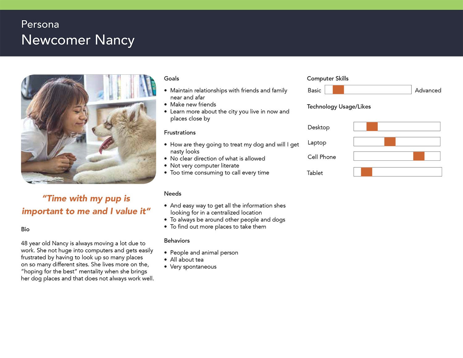
With the need to understand my potential users more I created 3 different personas that would encompass three different groups that my users fell into. The personas contain: who they are, goals, frustrations, needs, and behaviors. Each of my personas had an empathy map assigned to them which would help me to understand: what they think, what they see, what they hear, what they say and what they do. My three users are: Suzie The Seeker who represents the high computer user, Traveling Tom who represents the person always on the road with their dog and Newcomer Nancy who represents less computer experience and is new person in town.


User Stories
There are six primary MVP (minimum viable product) features that are being focused on to see if my ideas for the site were on track. I felt that with these main MVPs, I would get back valuable information to iterate on. There are also four secondary MVP features to focus on at a later date.
The user stories were based on the “As a user, I want to ….”. With the research prior to this step I decided on having the user stories be: on-boarding, user profile, search feature, photo feature, friends feature and comments and ratings.

MVP Diagram
Content Strategy
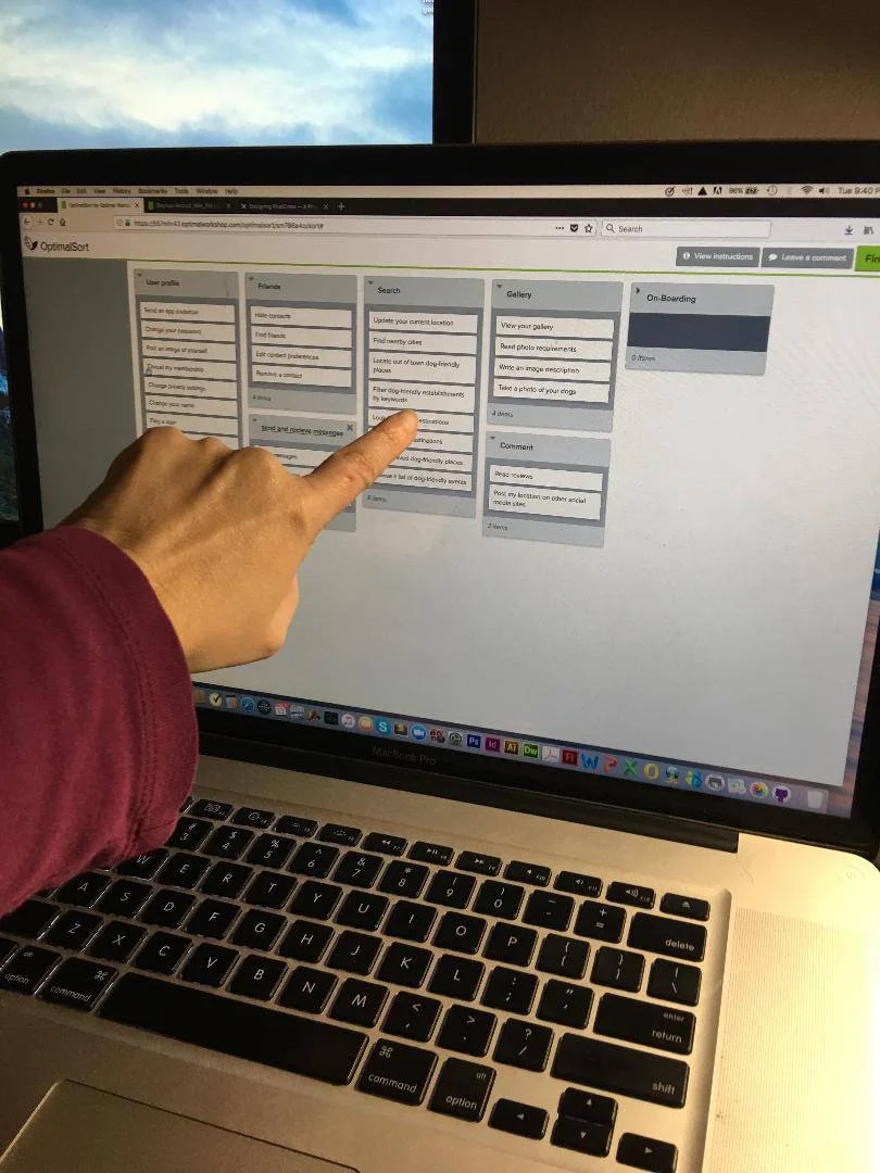
To make the information on my app more organized, I ran a card sort through Optimal Workshop with 30 task in a hybrid sort. Overall most of the eight participants were familiar with the categories with the exception of what ‘onboarding’ meant. There were a couple of times I needed to explain the meaning. Some (57%) of the testers felt that it would be better if ‘onboarding’ was changed to, “Sign Up” and placed under a “My Account” umbrella or simply offer a “Sign Up” or “Login” option. Also, 9% felt that “Calendar” should be a section by itself. Others thought that “Search” should be called “Destinations, Locations or Find Paces”.
It was interesting, however, that regardless of the category name changes — cards were placed in very similar groupings. (You can read the full report here)


Site Map
The site map was then created to show the information architecture of the results of the card sort. Because of the tester’s input I was able to see more clearly where certain aspects of the app were needed to be placed and connected to and be less painful to users.

Site Map Created in Draw.io
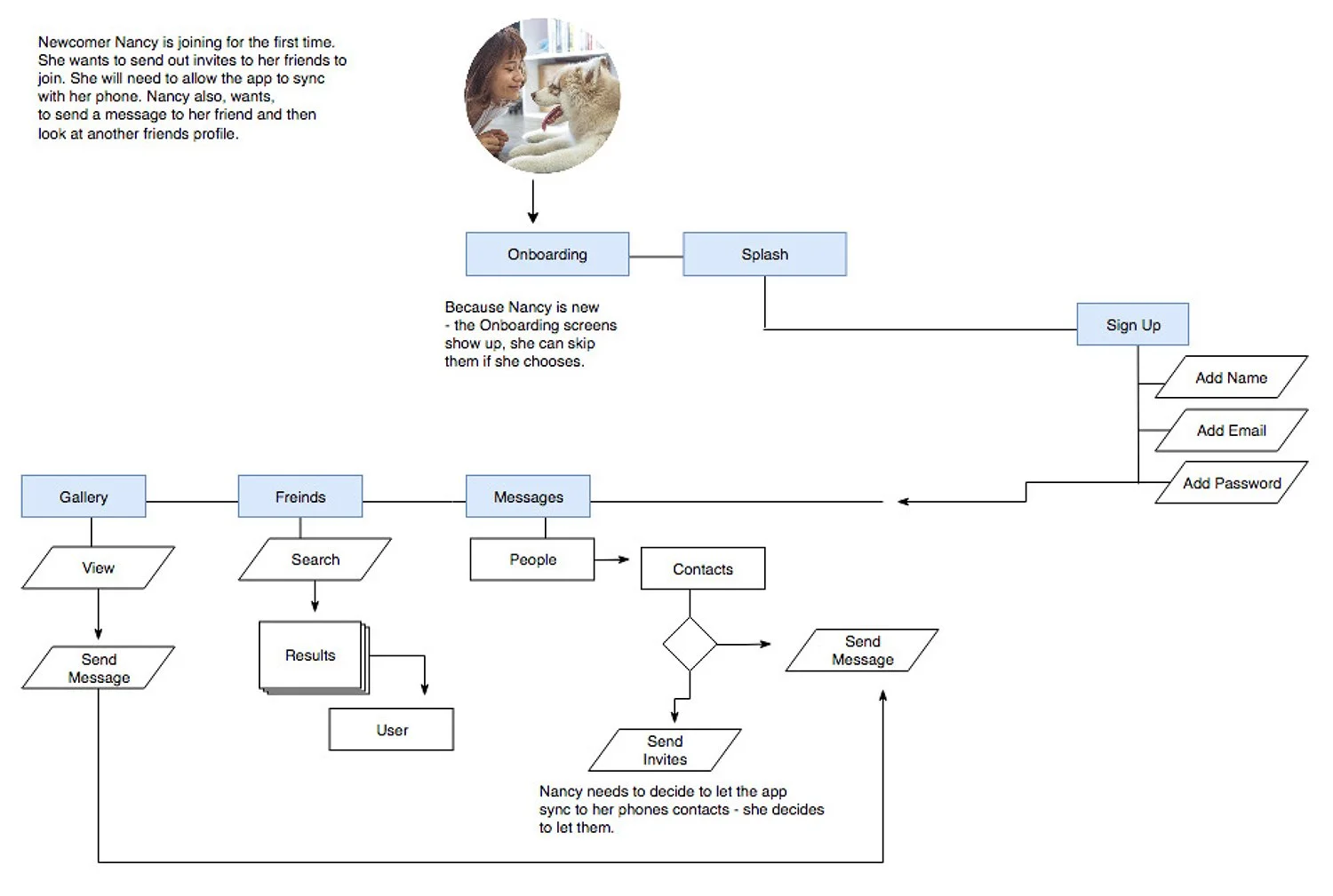
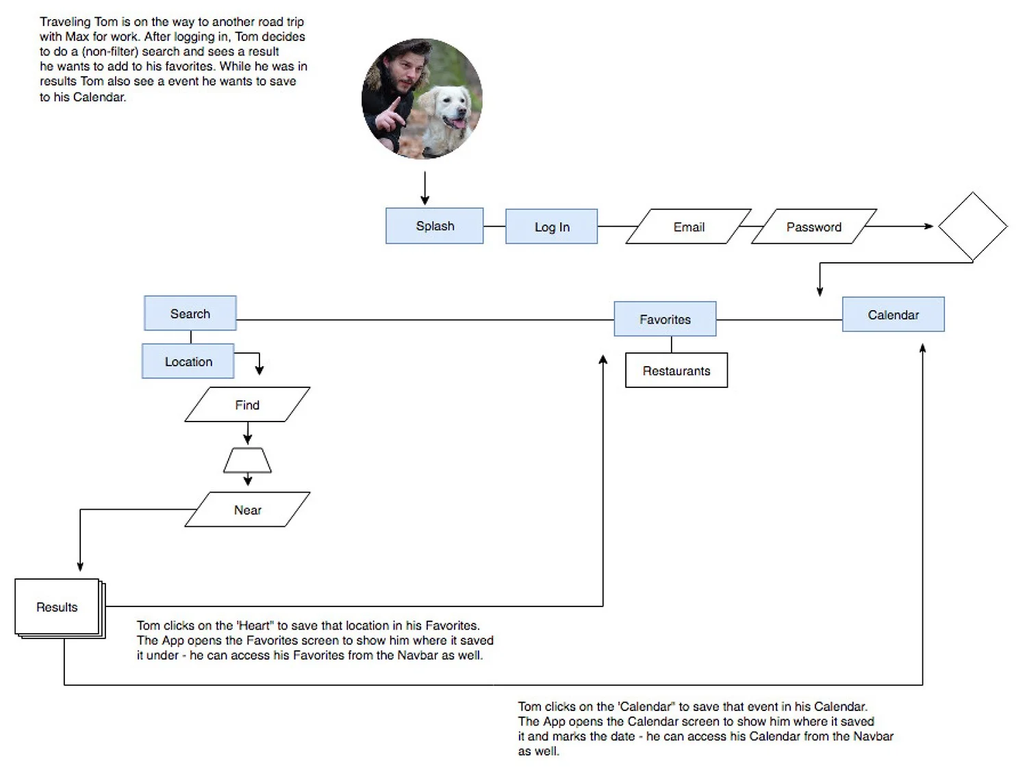
User Flows
Before designing the app, I mapped out scenarios for my three users by creating user flows. These flows were based on feedback so far, especially the goals and objectives identified in the empathy map. Each flow went through several iterations until all issues were resolved, resulting in smooth, pain-free paths that make it easier for users to achieve their goals.

Sketches and Wireframes
Before I started to wireframe I sketched out rough UI’s of all my screens to be able to see it as a whole. These went through a few iterations before turning them into wireframes. The sketches helped me to better understand what was actually needed on the wireframes and not needed, as well as content structure, navigation, interactions. I presented these sketches to my mentor and used his feedback to make changes as needed.

A Selection of MuttBuddy Sketches
When I began wireframing things became more realistic and began to fall into place. I was also continuing to do more research and iterations on certain aspects of the design such as on-boarding and filter control. I designed my wire frames in Sketch and I really liked how I could see them all laid out in their own sections and really notice the flow in a cleaner setting. This helped me to identify any missing steps or actions that needed to be worked on more and to identify useless steps.
There were quite a few iterations to my wireframes and the design process continued. Plus, as I moved further along into my wireframe I dove deeper and started to add some basic elements to my app. I needed to do this in order to experiment with other user actions in order to see a more realistic flow from screen to screen. I found that you are never really done iterating!
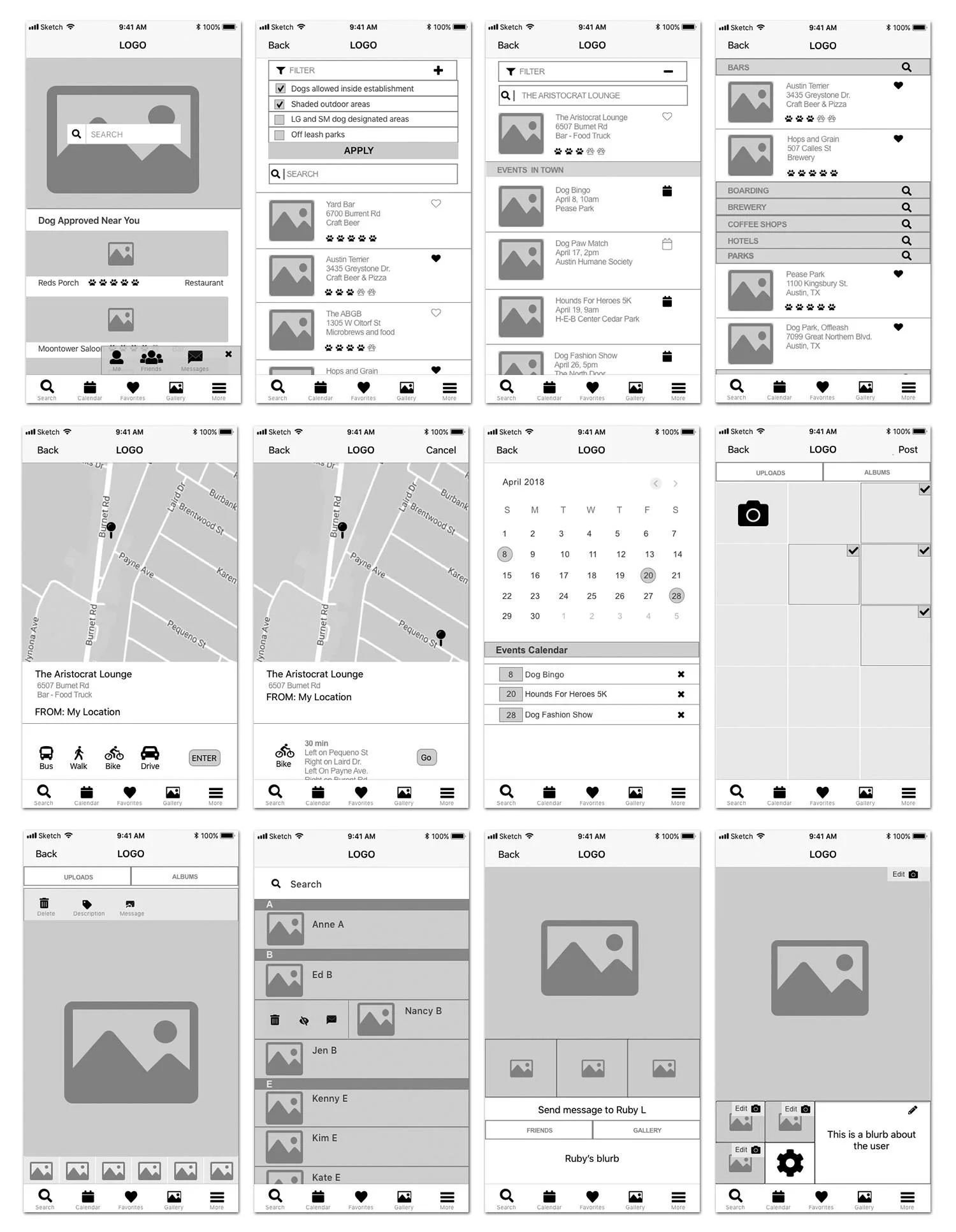
Selected Wireframes
Prototyping
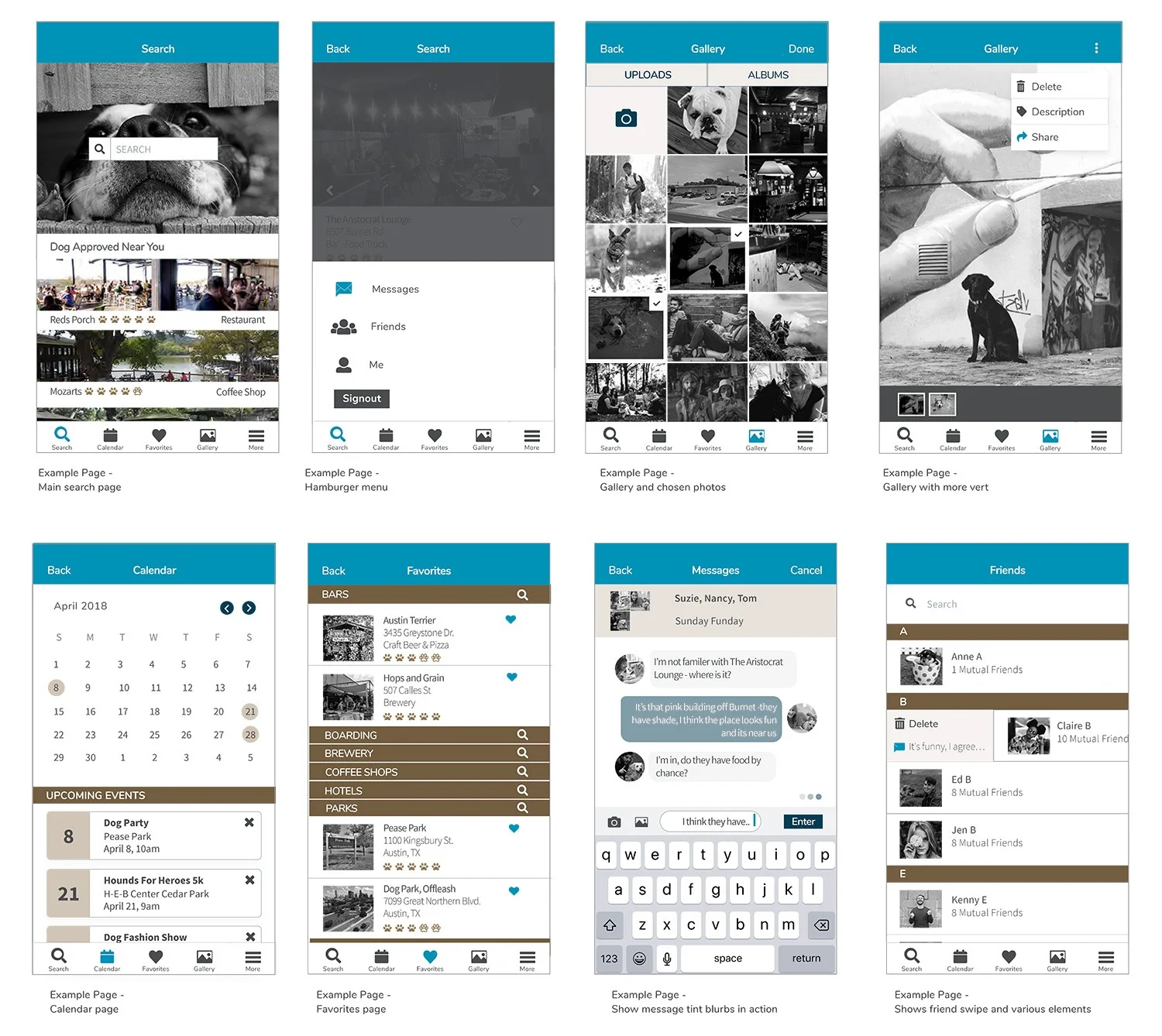
I decided to use Sketch with Craft and InVision to build my prototypes, which allowed the app to be tested in real-time! The prototypes started as low-fidelity and then evolved to medium-high fidelity without being fully fleshed out until much later. The reason I didn’t want to turn them into high-fidelity wireframes was to keep the focus on the actions rather than the appearance when people were testing them.
As I was working through the prototype, I realized that there needed to be some changes to the layout from the original wireframes to make it more user-friendly. For instance, I changed the filter controls to a familiar layout and designed it to open on a new page. I also added a sign-off button to the hamburger menu when I realized there was no way for the user to turn off the app, which is important. I continued conducting more research to find the best practices for handling the hamburger menu as well. As this goes through more iterations, it will become even better for the user!
Visual Design
When choosing the fonts, colors, and icons I wanted to take into consideration that this app needed to be used by every gender. A lot of research went into the psychology of colors and what they meant because I wanted something clean and modern — but also open, approachable, outdoorsy, and fun. But, more importantly, I wanted colors that would also work for people that were color blind. Since the three spectrums for color blindness have various ranges, I tried to use the colors that would have the least visible problems and use contrasting colors in type. Also, where applicable, I used icons to help further explain what that object or action does.
The logo is a dog’s head, posed in a friendly and curious stance. I wanted to keep the logo modern, clean, and non-cartoony looking — but still fun and friendly. I also wanted to keep the flow of the contrast going with the logo as well, which is why I kept it blue and white. To keep it simple, the logo is only allowed to either be placed on a white background or the #0193B7 Blue.
For the layout of the Style Guide, I designed it keeping in line with Brad Frost’s Atomic Design Methodology of atoms, molecules, organisms, templates, and pages. His methodology was a little confusing at times, but the more questions I had the more research I did and I was able to pick my mentor’s brain to learn more as well.

Usability Testing
Four users tested MuttBuddy, each with varying levels of experience using the internet and mobile apps. They were all representative of my target users. Most of the users had no trouble completing the tasks, but many were curious to learn more about the app. I did need to re-explain the limitations of the prototype at times, since only certain functions were included.
The main tasks I wanted to test were:
Use the app as a first-time user
Find and share a gallery photo
Send a message and a group message
Filter search results
Find and save a favorite establishment
Find and save a calendar event
With the feedback I received, I will move forward with further iterations and A/B testing. Here are some aspects I will specifically focus on:
Gallery: Determine the best way to add and view photos
“Add people” icon: Make the icon more understandable, as a few users were confused by it
Sharing an event or establishment: Allow sharing directly from the item’s information page instead of leaving the page to share
Favorites page: Ensure ease of use and clarity
I left the style guide off and removed the user story placeholders from the prototype I designed for user testing because I still did not want to distract from the matter at hand. (You can read the full report here)
Conclusion
Throughout this journey, from the beginning of the first idea to the last prototype, it has been an incredible learning experience! The various iterations I made along the way helped strengthen my knowledge and fueled my desire to conduct more research. MuttBuddy is a work in progress, and I will continue to make iterations and practice. The skills I have learned from this program are invaluable for my future UX career, and this project truly helped me deepen my understanding of the development process!
Thank you for taking the time to look at my first case study!